Introducing Our FROG LOGO
Hello, neighbors! I’m Lindsay Conrad, and I’m thrilled to have joined the KPSHA Board of Directors in April 2024. One of the first things that stood out to me was the board’s dedication to evaluating the community from both the residents’ and the board’s perspectives. It’s clear that fostering stronger connections within our neighborhood is a top priority—and that focus has led to some exciting new initiatives!
A big part of this effort was increasing support for community events that bring us all together. One of the first highlights was our Labor Day Picnic, which became a true celebration of our neighborhood. With live music, food trucks, a dessert competition, and a little friendly sports rivalry, the event was a huge success. Around 200 neighbors and friends joined in the fun, making it a perfect example of what we can achieve when we come together.
Then, in December, we welcomed the return of our beloved Christmas Tree Lighting event, now in-person once again! The night was filled with holiday cheer as Sequoyah kids had the chance to meet Santa, sip hot chocolate, create holiday crafts, and enjoy festive music. It was such a heartwarming occasion, reaffirming the close-knit spirit of our community.
But that wasn’t all! During a small committee meeting, I proposed the idea of updating our neighborhood logo. To my surprise, I found that many others had been thinking along the same lines. And so, we decided to bring a fresh, modern look to our brand—one that truly reflects the vibrancy and character of our neighborhood.
We were fortunate to have a local expert right here in our community: Eric Cheek, Senior Art Director at Tombras, who also happens to be a dedicated neighbor. Eric generously volunteered his time and talent to lead the rebranding project for the KPSHA Board—at no cost to us. Eric, his wife Kristy, and their daughter Sonoma, who attends Sequoyah Elementary, are all active members of the neighborhood, making this project even more meaningful for the Cheek family.
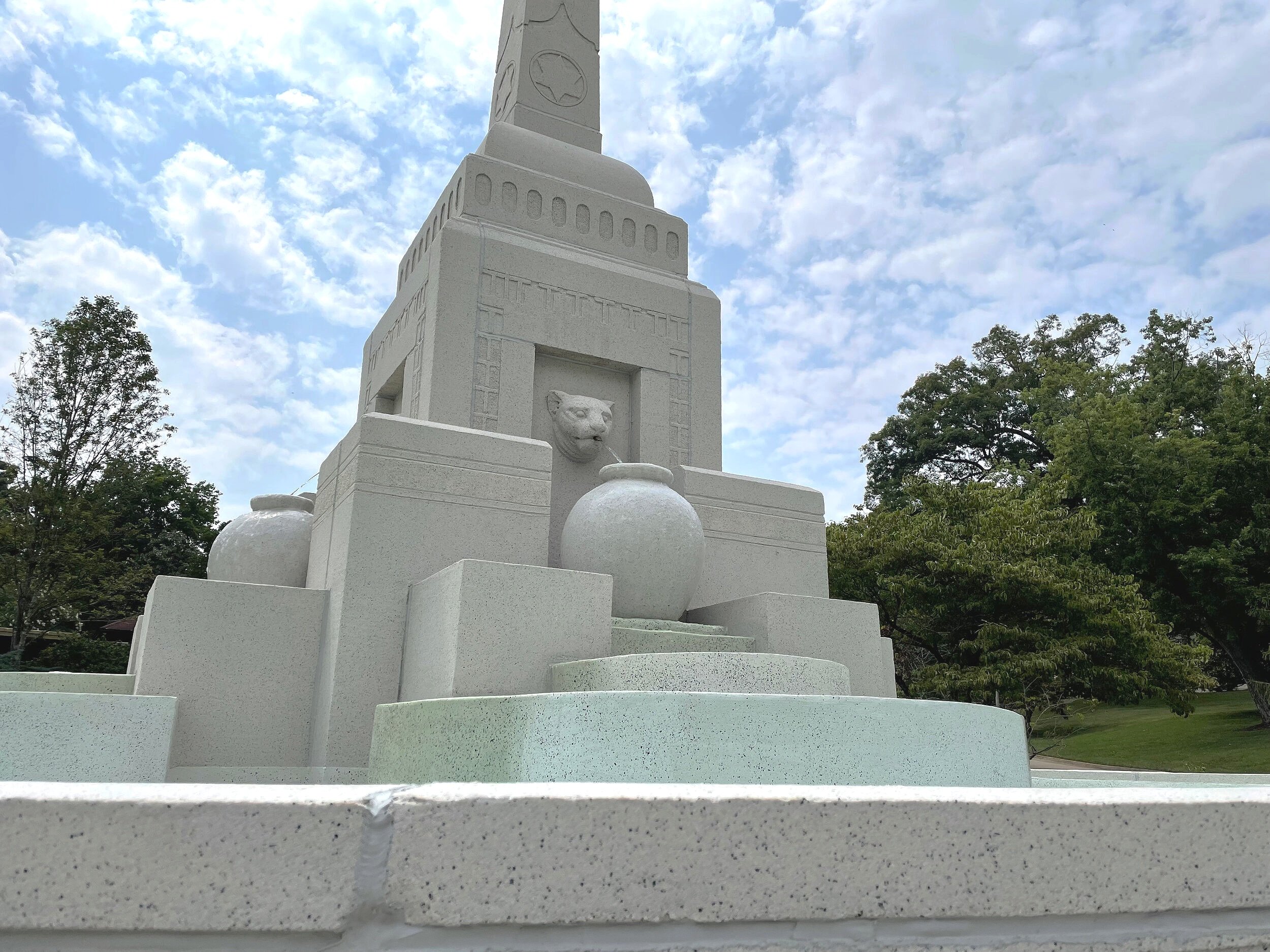
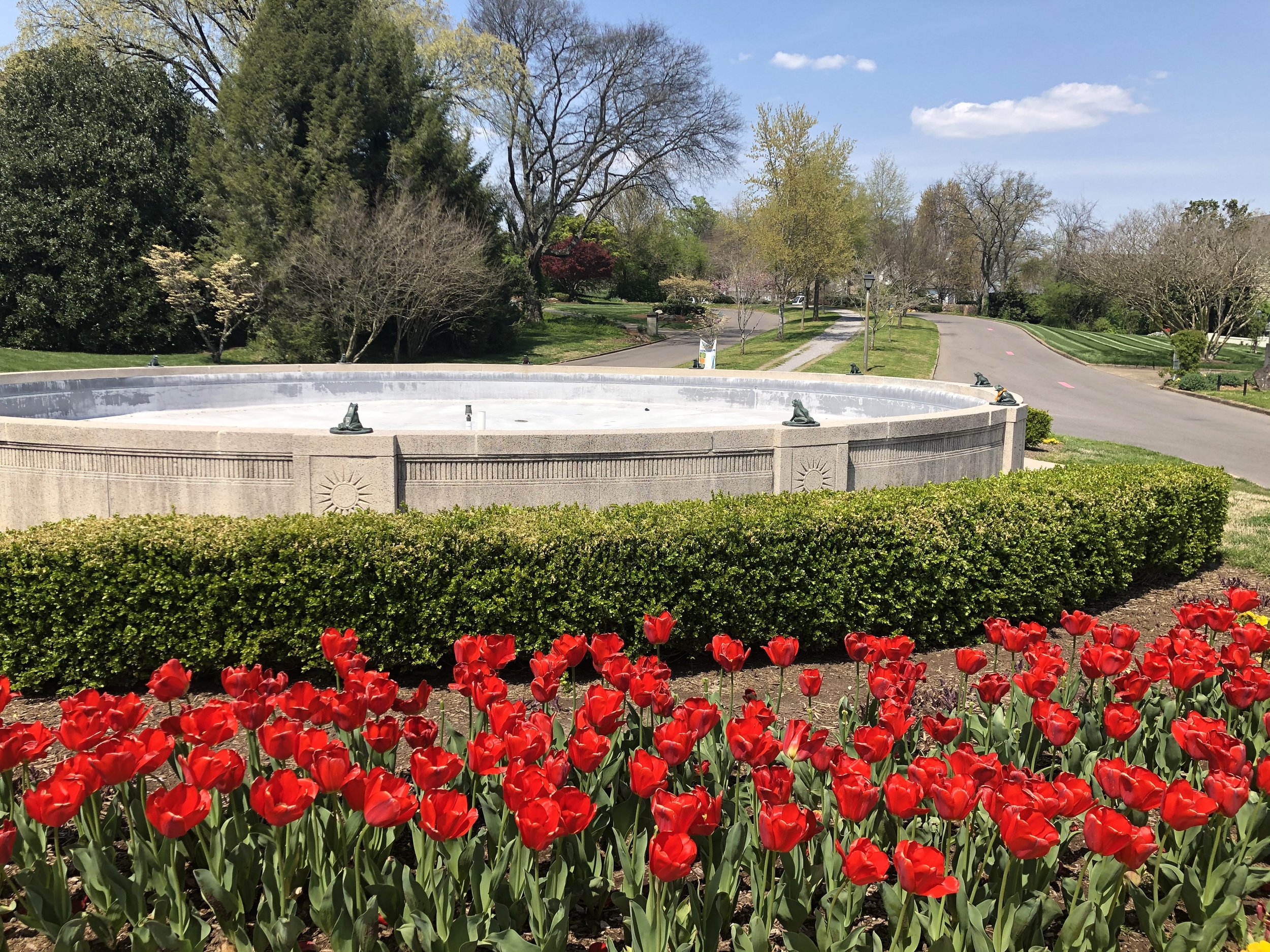
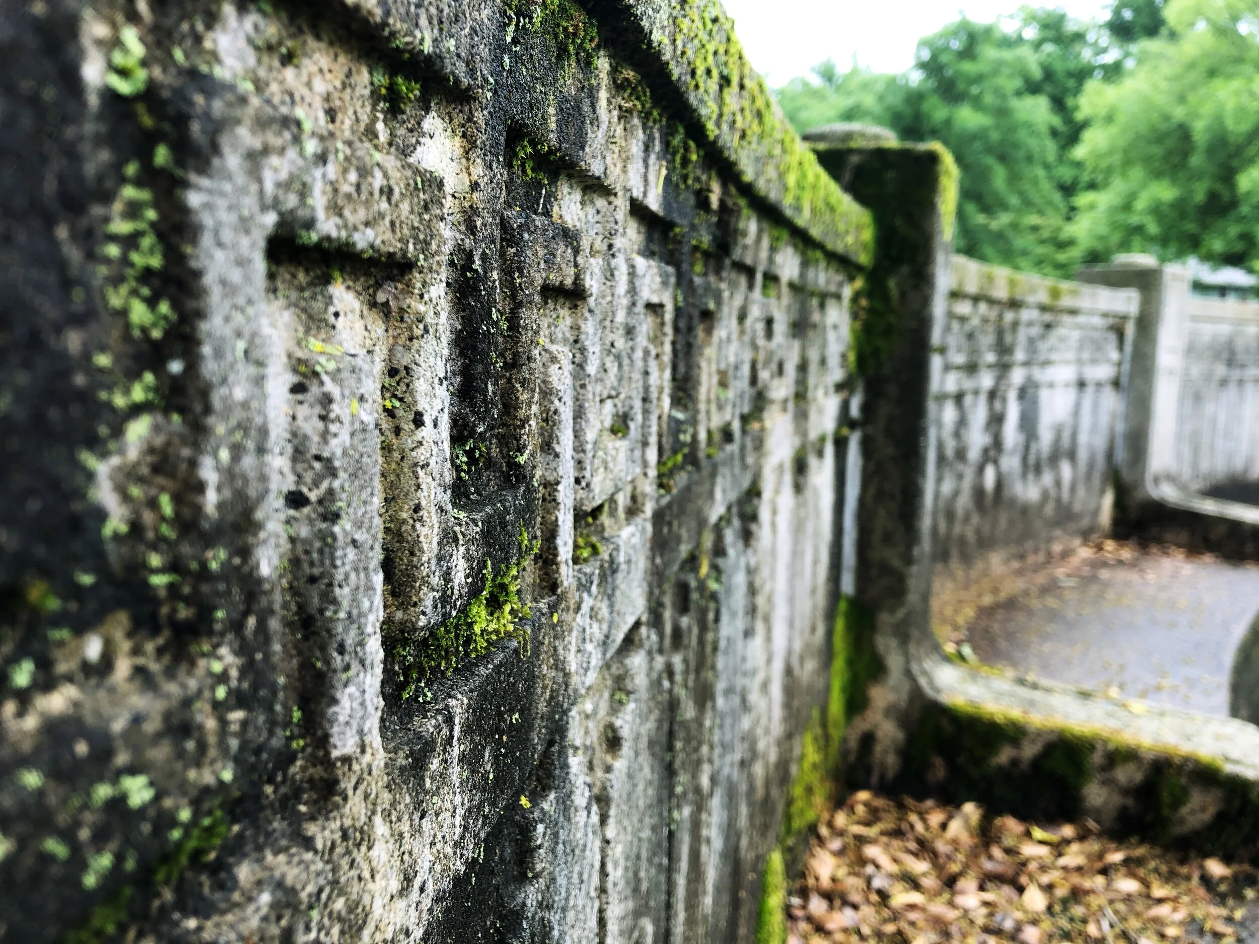
Eric took inspiration from our community’s landmarks—the Panther Fountain, Talahi Park’s distinctive architecture, and, of course, the iconic Frog Fountain (officially known as the Sunhouse Fountain). After careful consideration, it was clear that the frog would be the perfect symbol to represent the vibrancy and history of our neighborhood.
With that vision in mind, Eric designed our new logo and branding guide. The frog motif is not only a nod to our history but also a modern symbol of community and togetherness. It’s a fresh new look that will help us connect with the past while looking forward to the future.
As we head into the 2025 membership year, the frog logo will open up exciting opportunities for us to showcase our Sequoyah pride. We’re already brainstorming ideas for merchandise like t-shirts, magnets, and much more. Stay tuned for ways you can show off your neighborhood spirit with these new items!
We want to extend a heartfelt thank you to the Cheek family for their creativity, time, and dedication to this project. Their contribution has made a lasting impact on our community, and we’re so grateful for their support.
Here’s to an even brighter and more connected 2025!


Eric, Kristi, and Sonoma Cheek
SH residents and new LOGO designers. Thank you for your contribution to our great neighborhood.
Design Inspirations From The Neighborhood